How to Add Text to a Photo: Readable, Good-Looking Captions
Typing words onto a picture is easy. Making them readable on a busy background, at phone size, after a social network has cropped the image, is the hard part. This guide covers what makes text on photos legible, how to size and place it, and how to do it step by step in Photoyam.
Why text gets lost on photos
We read letters by their edges: the boundary between the letter and whatever is behind it. On a plain page that boundary is the same everywhere. On a photo it changes from letter to letter. White text can be crisp against a dark tree and vanish completely where it crosses a bright cloud. Fine detail such as leaves, gravel or a crowd also creates edges of its own that compete with the letter shapes.
The web accessibility guidelines (WCAG) ask for a contrast ratio of at least 4.5:1 for normal text and 3:1 for large text. A photo cannot be measured with one number, but the idea transfers: every part of every letter needs enough contrast with what is directly behind it. The weakest spot decides whether the caption works.
Four ways to make text readable on a busy photo
Try these in order; the first one that works is usually the best-looking.
- Move the text. Most photos have a calm area: sky, a wall, water, an out-of-focus background. Text placed there needs no help. If you are still shooting, leave room for the text in the frame.
- Add a soft shadow. A Drop Shadow with a large blur and little or no distance creates a dark haze around light letters. It lifts them from a mixed background without looking like an obvious effect.
- Add a thin stroke. An outline a few pixels wide in a dark color gives every letter a guaranteed edge. It is effective, but thick strokes look like a meme caption, so keep it thin.
- Put a band behind the text. A semi-transparent dark rectangle, or a gradient that fades from dark to clear, calms the background under the words. This is the method news sites and video thumbnails rely on because it works on any photo.
| Technique | Works best on | Watch out for |
|---|---|---|
| Placement in a calm area | Photos with sky, walls or soft backgrounds | Covering the subject’s face or key detail |
| Drop Shadow | Mixed light and dark backgrounds | Hard, offset shadows that look dated |
| Stroke | Very busy detail, small text | Thick outlines that fill in letter gaps |
| Dark band or gradient | Anything, including bright scenes | Hiding too much of the photo |
Font, size and hierarchy
Choose a sturdy font. Over photos, simple sans-serif typefaces with even stroke thickness hold up best. Thin, light weights and delicate serifs break up against texture. Script and decorative fonts are fine for one or two words, not for a sentence.
Use two levels at most. A clear title and a smaller line beneath it is enough. Make the size difference obvious, roughly two to three times, so the order of reading is never in doubt. Change size or weight, not both plus color plus font.
Size for the smallest view. Most people will see your image in a feed on a phone, often a few centimeters wide. Zoom out until the image is that small on your screen. If the text is hard to read there, it is too small or too thin.
Mind the spacing. Letter spacing and leading (the gap between lines) matter more at large sizes. Big headlines usually look better slightly tighter; small text in all capitals needs a little extra letter spacing.
Placement, margins and safe zones
Keep text away from the edges. A margin of about 5% of the image width on every side looks deliberate and survives small crops. Align text to something: the left edge of a block, the center line of the image, or a strong line in the photo itself. Left-aligned text is easiest to read for more than one line; centered text suits short titles.
Social platforms crop and cover images, so check where yours will appear:
- Stories and vertical video (1080 × 1920). The top and bottom of the screen are covered by the profile name, reply box and buttons. Keep text roughly 250 pixels away from the top and bottom edges.
- Profile grids. Many networks show a cropped preview in the profile grid, so a title near the top or bottom of a tall image may be cut off there.
- Video thumbnails (1280 × 720). The video length is shown in the bottom-right corner. Keep that area free.
- Link previews (1200 × 630). Some apps crop these to a square, so keep important text near the center.
Step by step: add text in Photoyam
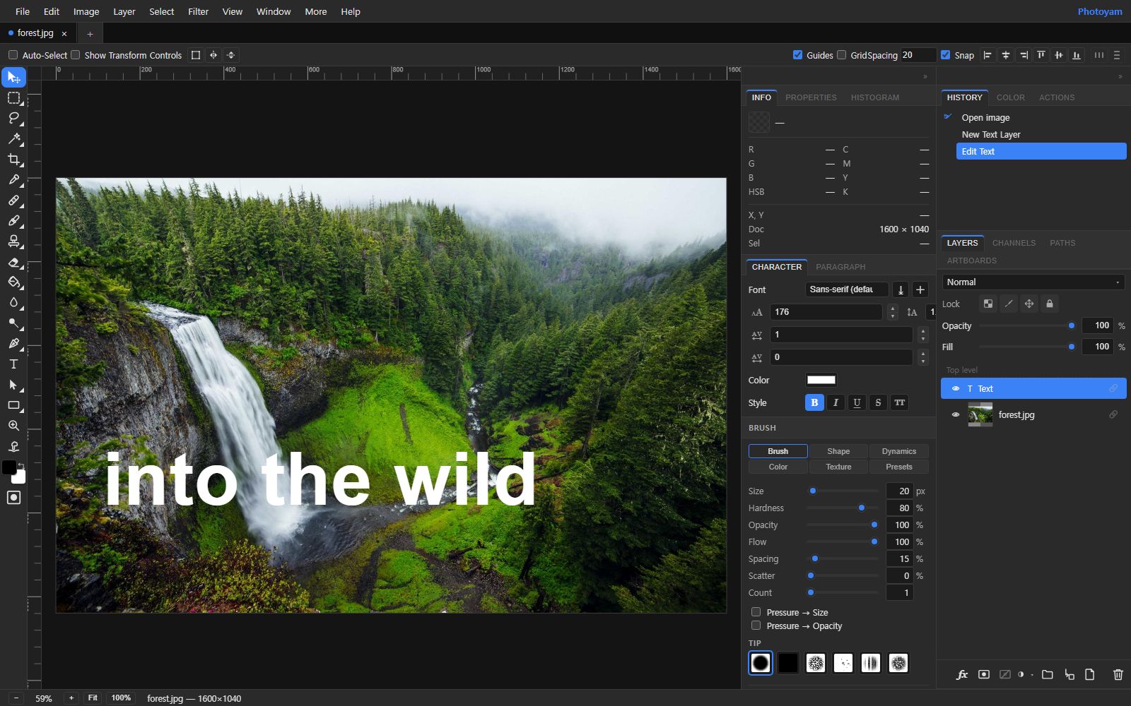
- Open your photo with the Type tool ready. On the Add Text page, click Choose an image or drop a file. The photo opens in the full editor with the Text tool already selected. (In the editor directly, pick the T icon in the toolbar.)
- Click and type. Click where the text should start and type. Each click in an empty spot creates a new text layer in the Layers panel; clicking existing text with the Text tool opens it for editing again.
- Set font, size and color. With the text layer selected, use the options bar or the Character panel: Font, Font size, Color, Leading, Kerning, letter spacing, and the style buttons for Bold, Italic, Underline, Strikethrough and all caps. The font picker also has Upload font for your own WOFF2, WOFF, TTF or OTF file.
- Set alignment and wrapping. The Paragraph panel sets alignment (left, center, right or justify). By default text is point text and grows freely; give it a Box width to make it wrap like a paragraph, and adjust indents and paragraph spacing if needed.
- Position it. Switch to the Move tool and drag the text into place. Turn on Show Transform Controls in the options bar to scale or rotate it.
- Add readability effects. Click the fx button at the bottom of the Layers panel (or right-click the layer and choose Blending Options) to open Layer Style. Enable Drop Shadow and set Blur, Distance, Angle and opacity, or enable Stroke and set its Width and Color. Click Done. The text stays editable with its effects attached.
Adding a dark band behind the text
Add a new layer below the text layer (Layer › New Layer, then drag it under the text in the Layers panel). With the Rectangular Marquee, set a Feather value in the options bar for soft edges, draw a band around the text, and use Edit › Fill… with black. Lower the layer’s Opacity to around 40 to 60% until the background calms down but stays visible. For a fade instead of a band, use the Gradient tool on that layer with a black stop at full opacity at one end and zero opacity at the other, which you can set in the Gradient Editor.
Exporting
Choose File › Export As and pick PNG, JPG or WebP, or use Save for Web… to compare file size and quality. Text has sharp, high-contrast edges, and JPG compression tends to leave faint smudges around them, so use a high JPG quality or PNG for graphics that are mostly text. Exported files contain the text as pixels. To keep it editable, also save a project with File › Save As Project (.psy).
Common mistakes
- Checking only at full size. Text that looks huge on a monitor can be tiny in a feed.
- Covering the subject. Text across a face or the product fights with the photo. Work with the composition, not over it.
- Too many fonts and colors. One typeface in one or two weights is almost always enough.
- Hugging the edge. Text touching the border looks accidental and is the first thing a crop removes.
- Heavy effects. A thick stroke plus a hard shadow plus a glow makes text harder to read, not easier.
- Exporting over the original. Keep the clean photo; you will want it for the next caption.
Try it in Photoyam
Add editable text to any photo with full font, size and color control, plus shadows and strokes for readability. Free, no sign-up, and nothing is uploaded.
FAQ
Can I edit the text after I add it?
Yes, as long as you are still working in the editor. Text lives on its own text layer: click it with the Text tool to change the words, or select the layer to change font, size and color. Once you export a PNG, JPG or WebP, the text becomes pixels. Save a project file if you want to come back and edit it later.
Can I use my own font?
Yes. The font picker has an Upload font option that accepts WOFF2, WOFF, TTF and OTF files. In Chromium-based browsers such as Chrome and Edge, Load system fonts can also list the fonts installed on your computer, after you grant permission.
Will people who view my image need the font installed?
No. When you export, the text is drawn into the image as pixels, so it looks the same everywhere. Make sure your font's license allows use in images you publish.
How do I make white text readable on a bright photo?
Move the text to a darker, calmer part of the photo if you can. Otherwise add a Drop Shadow or a thin dark Stroke from the layer style (fx) options, or place a soft, semi-transparent dark band behind the text.