How to Convert a Photo to Black and White (and Make It Look Good)
Removing color takes one click. Making the result look intentional, with deep blacks, clean whites and a subject that stands out, takes a little more understanding. This guide explains what happens to your colors when they turn gray, how to control it, and how to add contrast and tone.
When black and white works
Taking color away shifts attention to what is left: light, shape, texture and expression. Photos that tend to gain from it include:
- Strong directional light. Side light across a face, shafts of light in a street, hard shadows from a window. Monochrome turns light into the subject.
- Texture. Weathered wood, rock, wrinkled skin, fabric, bark. Color often competes with texture; gray lets it show.
- Graphic shapes. Silhouettes, architecture, repeating lines.
- Distracting or ugly color. Mixed indoor lighting with orange and green casts, a clashing shirt, a busy background full of bright signs.
It rarely rescues a photo whose appeal was its color, such as a sunset, autumn leaves or a plate of food, and it does not fix a flat, low-contrast image on its own. If the light was dull, the black and white version will be dull too until you add contrast.
How color becomes gray, and why one click can look flat
Every pixel in a color photo has red, green and blue values. To make it gray, software has to collapse those three numbers into one brightness value, and there is more than one way to do that.
A simple average, (R + G + B) ÷ 3, treats every color as equally bright. Our eyes do not: pure green looks far brighter to us than pure blue at the same value. So most grayscale conversions, including Photoyam’s quick tool and the editor’s Desaturate and Mode › Grayscale, use a luminance formula that weights the channels by how bright they appear: about 30% red, 59% green and 11% blue (the Rec. 601 weights).
That gets overall brightness right, and it still produces flat results for a specific reason. Two very different colors can have the same luminance. A red rose and the green leaves around it may be equally bright; in color they contrast strongly by hue, but in gray they turn into the same mid-tone and the flower disappears into the foliage. The same happens to a blue sky and a pale building, or to skin and a red wall.
The fix is channel mixing: deciding, color by color, how light each hue becomes. Black and white film photographers did this with colored lens filters. A red filter lets red light through and blocks blue, so blue skies print dark and dramatic while red and orange tones print lighter. A green filter lightens foliage. The Black & White adjustment in the Photoyam editor gives you the same control with sliders.
Quick conversion with the Black & White tool
For a fast, good-looking result without opening the full editor, use the Black & White tool.
- Open your photo. Click Choose an image on the Grayscale page, or drop a file onto it. The Black & White window opens and shows your photo already converted. Images larger than 1,600 pixels on the longest side are scaled down to 1,600 pixels.
- Pick a Tone. B&W gives neutral grays. Sepia warms the same grays toward brown, the look of an old print.
- Set Strength. At 100 the image is fully monochrome. Lower values blend the original color back in: around 60 to 80 gives a muted, faded-color look, and with Sepia it gives a gentle warm wash rather than a full antique effect.
- Download.
Click Download PNG. The file is saved with
-bwadded to the original name.
The quick tool uses the luminance formula described above. It works well for portraits in soft light and for scenes that already have strong light and dark areas. If important parts of the photo merge into the same gray, move to the editor.
Full control in the editor
In the Photoyam editor, the best approach is an adjustment layer: a layer that changes the look of everything below it without touching the pixels, so you can revise it or switch it off at any time.
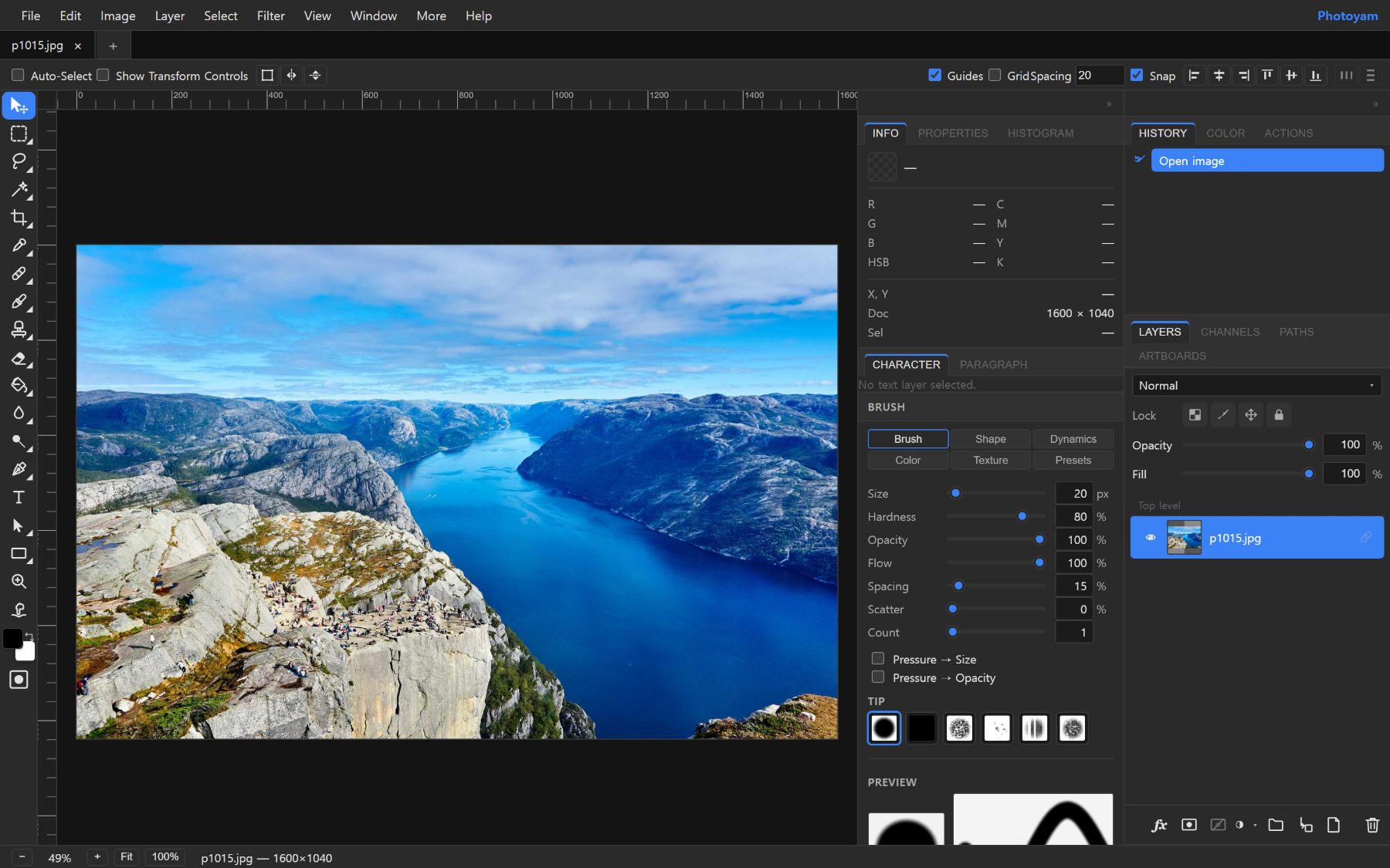
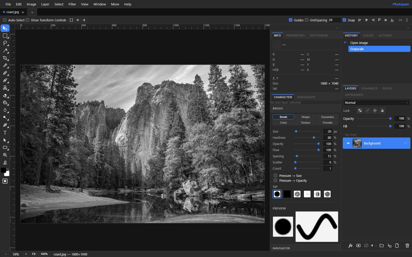
- Add a Black & White adjustment layer. Open your photo, then use the adjustment button at the bottom of the Layers panel (the half-filled circle, New adjustment layer) and choose Black & White. Its sliders appear in the Properties panel. (Image › Adjustments › Black & White applies the same thing permanently to the current layer.)
- Mix the colors. There are six sliders: Reds, Yellows, Greens, Cyans, Blues and Magentas, each from 0 to 300%. Higher makes that color lighter in the result, lower makes it darker. The defaults approximate a standard luminance conversion. Neutral grays in the original are not affected, only colored areas.
- Add contrast with Curves. Add a Curves adjustment layer above the Black & White one. Pull the lower part of the curve down slightly and the upper part up slightly, a gentle S shape. This deepens shadows and brightens highlights while keeping mid-tones. Use Levels instead if you just want to set the darkest and lightest points.
- Check the extremes. A strong print usually has a little true black and a little clean white somewhere. Look at the Histogram panel: if the data stops well short of both ends, there is room for more contrast.
- Export. Use File › Export As and pick PNG, JPG or WebP.
| Subject | Try this | Effect |
|---|---|---|
| Blue sky with clouds | Blues and Cyans down | Darker sky, clouds stand out (like a red filter) |
| Portraits | Reds and Yellows up | Smoother, brighter skin; blemishes less visible |
| Landscapes with foliage | Greens and Yellows up | Lighter leaves and grass, more separation from bark and rock |
| Red subject on green | Reds up, Greens down (or the reverse) | The subject separates from its background |
Sepia and split toning
A toned image is still monochrome, but its grays carry a slight color. Warm tones feel nostalgic; cool, slightly blue tones feel quiet and modern.
- Sepia or a single tone. Turn on Tint in the Black & White adjustment and choose a Tint Color. The default is a warm brown. Pick a low-saturation color; strong tints look artificial.
- Split toning. This tints shadows and highlights with different colors, classically cool shadows and warm highlights. Add a Color Balance adjustment layer above your black and white conversion, move Shadows Yellow/Blue a little toward blue and Highlights Yellow/Blue a little toward yellow. Small values, often under 15, are enough.
- Duotone. The Duotone adjustment maps the tones of the image onto one to four inks (Monotone, Duotone, Tritone or Quadtone), the way printers do with extra ink plates. A near-black ink plus a warm brown gives a rich, print-like tone.
Common mistakes
- Converting a flat photo and stopping. Gray images need more contrast than color ones, because color was doing part of the work of separating objects.
- Overdoing the sliders. Extreme mixes create unnatural halos where two colors meet, and blotchy skin in portraits.
- Converting destructively without a copy. Mode › Grayscale flattens the image and discards color. Use an adjustment layer or keep the original file.
- Crushing all detail. Pure black shadows and pure white highlights should be small areas, not large blank patches.
- Judging on a tinted screen. Night-mode screen filters make neutral grays look warm. Turn them off before judging a toned image.
Try it in Photoyam
Turn a photo black and white or sepia in a few seconds, or open the full editor for per-color mixing, Curves and toning. Free, and your photo never leaves your device.
FAQ
What is the difference between grayscale and black and white?
In everyday use they mean the same thing: an image made only of shades of gray. A grayscale conversion usually implies one fixed formula, while a black and white conversion in an editor lets you decide how light each original color becomes.
Can I get the colors back after converting?
Not from the converted file itself, because the color information has been discarded. Keep your original. In the Photoyam editor, a Black & White adjustment layer is non-destructive: hide or delete it and the color photo is untouched underneath.
Why does the quick tool save a PNG?
PNG is lossless, so the conversion is saved without adding compression artifacts. If you need a smaller file for the web, convert the PNG to JPG or WebP afterwards.
How do I make a sepia photo?
In the Black & White tool, set Tone to Sepia. In the editor, turn on Tint in the Black & White adjustment and pick a warm brown Tint Color, or use a Duotone adjustment with a dark brown ink.